📘 Project Information
This project focuses on visualizing crucial public health and environmental data to make it more understandable and accessible for decision-making.

📖 Introduction
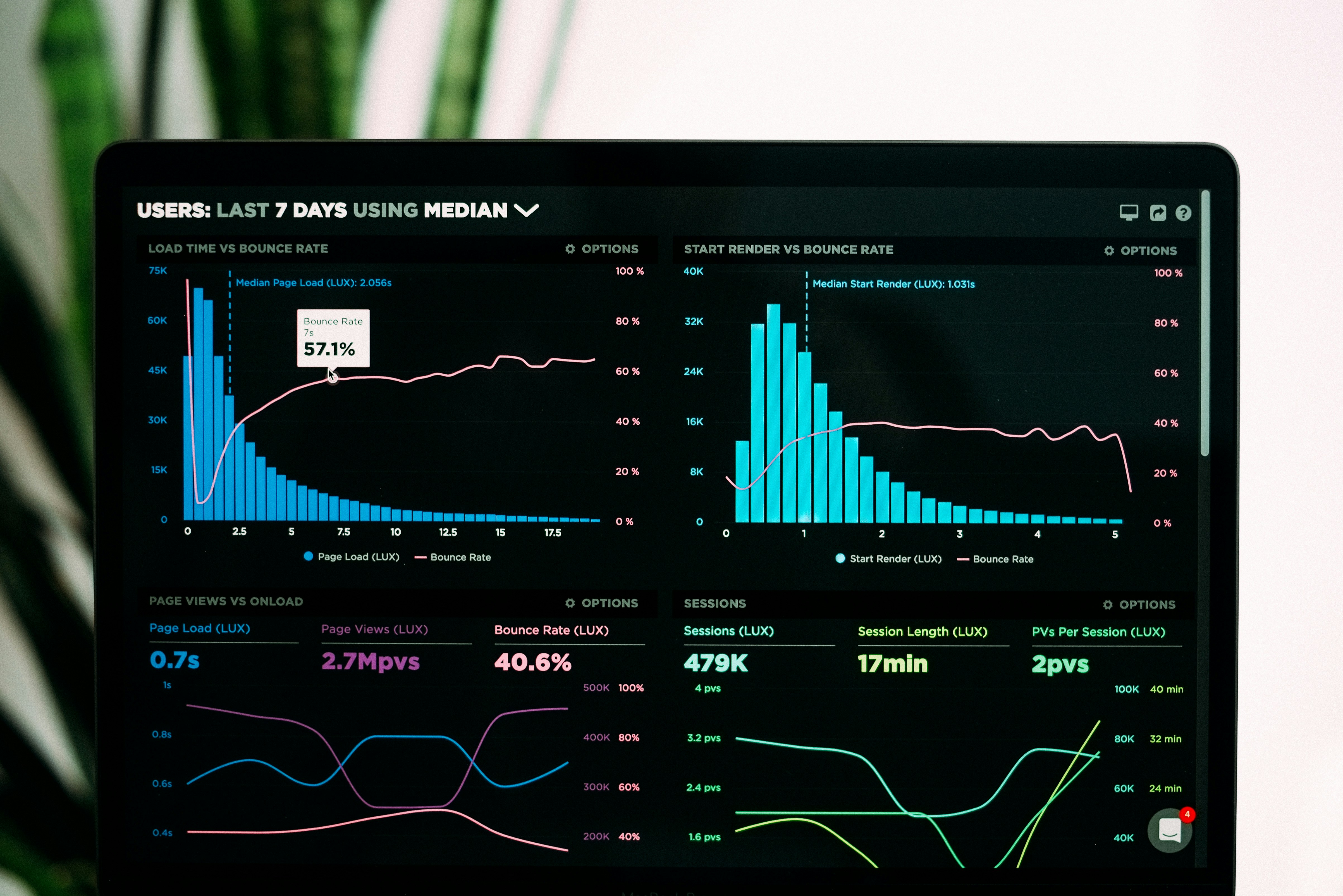
With the rise of health-related issues and climate challenges, visualizing large datasets has become a necessity. Data visualization helps us see hidden patterns and take better actions.
⚠️ Problem Statement
1. Obesity Trends Analysis
Even with increasing awareness about health, obesity rates are rising steadily among different populations, particularly in children and teenagers. There is not enough clear data visualization that shows how obesity is spread across age, gender, and region. This gap makes it difficult for policymakers and health professionals to create focused interventions.
2. Malnutrition Monitoring
Malnutrition, which includes both undernutrition and overnutrition, remains a significant global challenge, particularly in developing countries. However, the data we have on malnutrition is often broken up and not effectively visualized. This makes it difficult to track progress towards healthrelated goals like the UN Sustainable Development Goals (SDGs).
3. Dietary Habits and Lifestyle Impact
Unhealthy eating habits, including the high intake of fast food and sugary drinks, are closely linked to lifestyle diseases. Yet many communities lack detailed data-driven insights into how these habits relate to obesity, diabetes, and heart disease risks. Without effective visualization, it is hard for individuals and public health authorities to understand and respond to these patterns.

📚 Literature Review
Several studies emphasize the role of visualization in public health. Infographics, dashboards, and charts improve communication between researchers and the public.
🛠️ Methodology
The methodology includes data collection, preprocessing, visualization design, and dashboard implementation for effective decision-making.

🔎 Observation and Analysis
Through visual analytics, trends in obesity, malnutrition, and lifestyle impacts are observed across different demographics.
✅ Conclusion
Data visualization bridges the gap between raw data and actionable insights, empowering communities and policymakers to take better health decisions.